Tuesday, April 29, 2014

Game Review: Take Your Chances With Ice Road Truckers

wp_ss_20140304_0003

The popular A&E Television show, Ice Road Truckers, tells the story of the brave souls that risk it all to get huge shipments from the safety of solid ground up to areas that just have no business getting equipment like it delivered. While the show has hair raising experiences and death-defying odds, the Ice Road Truckers title from Kuma Games just didn’t bring the same excitement to my Windows Phone.

wp_ss_20140304_0004

In all honesty, Ice Road Truckers is nothing more than another ‘runner’ style game, but with a bit less fun and excitement. You start out simple enough on an icy road with your semi-truck full of logs or something. To be honest, I still haven’t figured out what I was supposed to be pulling, but that’s besides the point. The game accelerates for you and you simply move left or right to get more coins as you travel down the road for as long as you can.

wp_ss_20140304_0005

A short ways into the game, you start to see some fun obstacles, like jumps and road blocks. Once you figure out you can move on a dime, these become a bit less than difficult to navigate. Simply tapping the sides of the screen or using the accelerometer to turn, you can quickly master the simple controls.

wp_ss_20140304_0006

Overall, Ice Road Truckers gets a pass rating from me. With runner/chaser games like Despicable Me: Minion Rush out there, IRT just doesn’t measure up. While it might be a good looking title from the graphics screen, the simplistic play and poor level of difficulty just makes this one seem a bit boring.

Saturday, April 26, 2014

Game Review: Bad Traffic Speeds Away The Hours

wp_ss_20140423_0002

Bad Traffic by GreenCod Apps is one of those games that just draws you in quickly. Starting out, you see a simple four way intersection pop up on your screen. The goal, to speed up and slow down cars to make sure that they all arrive safely at their destination. The problem is, I almost immediately got bored with it. Turns out, I needed to give it a few more minutes of my time before finding out how fun and challenging this little game was going to be.

wp_ss_20140423_0003

The simple city streets quickly became 6 entry points and 5 crossing points before I knew what hit me. Then trucks and different speed cars started appearing. Within minutes, this boring tap the car and go faster game had become one where I had to watch what I was doing to avoid a crash.

wp_ss_20140423_0001

Of course even the faster levels in Bad Traffic were easy to clear at first, but after a few more minutes of speeding up and slowing down those pesky little cars, trucks and motorcycles, I had to blink again as the levels started getting a bit tougher to look at. I found that I could tap the same car two or three times to get super speed boosts and really figured out how braking worked for stopping the annoying ones that I was about to crash into.

  wp_ss_20140423_0004

Once the levels in Bad Traffic stepped it up again, I found myself strangely drawn into the game. It isn’t one that will find a permanent home on my Nokia Lumia 925 due to space issues, the 124MB download is just a bit rich for a simple title in my book, but if I had something with more storage or a MicroSD card after the 8.1 update, it might have hung on a bit longer.

Overall, Bad Traffic is a great App for those that like the action-puzzle genre of gaming. The graphics are stellar and game play is easy to figure out. The challenge of this title is completely in the speed of the game. Bad Traffic is completely worth the download and test run. The free title is available by clicking the link to head to the Store below.

Bad Traffic

Nokia Lumia 520 And 521 Top Amazon No Contract Phone Sales Again

image

There is something amazing about the current entry level Lumia’s that are available for AT&T and T-Mobile. A person can snag a non-contract device with a beautiful 4” display, 8GB of internal storage with MicroSD expansion, a 5MP camera and offline GPS navigation for under $100. Depending on your network, the 520 can be had as low as $50 on sale and the 521 can be found in the $70 range as well. These two little devices can hold their own against their Android powered counterparts that cost $200-300 without contract.

Now, it isn’t all perfection with these lower range Lumia’s. You do sacrifice a bit on the performance front with a slower processor. You also do not get that selfie-empowering front camera. There is also no flash for the rear camera, which does not feature PureView either. But honestly, if you are looking for a daily driver or a replacement phone, these two little monsters are the perfect solution.

It should also show everyone how popular these two Windows Phones have become as they once again top the Amazon No Contract Phone sales in not just the top spot, but both the number one and number two positions. These two phones are outselling the iPhone 4 prepaid Verizon device, the Moto G on every carrier, the Samsung Galaxy S III prepaid options and even the no contract iPhone 5s. These two devices are blowing the competition away.

If you are in the market for a backup device, that will run the developer preview of Windows Phone 8.1, this could be the day to grab one. currently Amazon has the 520 under $70 and the 521 under $90. These aren’t the best deals ever, but it makes for a compelling case to grab one right now and start playing. When you can grab a Lumia 521 and add it to your T-Mobile family plan for $10, why not add another device to your pocket, right? Ok, maybe you just want to use it as a business line or something, but check out the Lumia 520 or 521 today and see what all the excitement is about.

Online Link

Friday, April 25, 2014

Using The New Windows Phone 8.1 Speed Dial


wp_ss_20140425_0003

One of those surprising new features that I never noticed in Windows Phone 8.0 is the new speed dial screen in the 8.1 Developer Preview. I can’t believe that I hadn’t found this one earlier in my playing, but it is one of the high points for me in the preview. Taping the phone tile always brought me to my call history screen. Now, there’s a better way than searching by name for those that you love to call that fall off the first page during the day.

wp_ss_20140425_0004

With a simple long press of a name in the history list, it brings up a new menu. The new menu includes a few options that are very useful. The first is to view the call details. The second deletes the call from your list. The third is the ever popular call blocking feature. The fourth is the new “add to speed dial” feature. By selecting this item, you can swipe once to get to the next screen. This screen will contain all the numbers that you have added to your speed dial list.

wp_ss_20140425_0005

The speed dial list allows one touch calling to anyone on the list by just tapping their entry. Make sure when you add people that you add their correct number and not a secondary or work number. If you do, you will keep calling that number from the speed dial menu. Overall, this is a huge time saver for me and I am really impressed with how well it fit my needs.

Monday, April 21, 2014

App Review: Figure Out How Much You Could Save With Amortize

wp_ss_20140419_0001wp_ss_20140419_0002

This is one of those quick reviews for a super-simple App. Amortize, does exactly what the name of the App by GroundSpeed implies, it is a amortization table App that will tell you (or your customers) how much their loan will cost them every month. Want to see how a 30 year loan payment looks against a 15 year? Just pop in the terms in the rate and term boxes and you will see the monthly payment change.

Amortize is fully functional, but there were a few features I would love to see in it for an update or a new release. The first would be a comparison window or line. Maybe even just doubling up the layout so you can do two different options at once? That way it would work for showing the difference in monthly payments better. The next upgrade I would love to have is a total payment line that would simply show the monthly payment multiplied by the term. Finally, I would love to see an “email this” button on there somewhere. It would be nice to send the results to someone that is considering loans.

Overall though, Amortize really does a perfect job of what it is supposed to do. It gives you the monthly payment based on the loan amount, down payment, interest rate and length of the loan. It really is a great addition to your Windows Phone if you are shopping for a car, home or even just considering taking out a line of credit. Amortize is available for free in the Windows Phone Store.

Store Link: http://www.windowsphone.com/en-us/store/app/amortize/56c51d13-563b-4329-8f6e-e14abf84ecc2

Thursday, April 17, 2014

App Review: Track Your Cash And Cards With Akche

wp_ss_20140407_0013

As someone that lives on a cash budget, I really appreciate any tools that make it easier to track where my money goes. Akche by IdeaLabs is one of those tools that does so much to help with my budgeting, that I wonder how I kept track of everything without it. The basics of the App in a nutshell is that it tracks cash, credit or other funding for you. It’s quick to learn, easy to use and as powerful as you want to make it. Overall, except for a few missing features, Akche is an App that everyone should try out.

wp_ss_20140407_0012

Akche is capable of tracking cash, credit or any other kind of account you want to throw at it. You can use it as a check registry, a cash monitor or even an expense tracker for work. Keep in mind that it doesn’t hold official receipts, so you might need to keep saving those if you are tracking your work expenses with it.

The use of Akche is very simple. Enter your accounts, and press the plus or minus sign at the bottom to enter a transaction. It’s that easy. Once you enter the information on the transaction, you will see a list of them pop up in the section you entered it. For example, I gave myself $200.00 in spending money above in my wallet. I spent $39.99 buying a cell phone refill card and $58.60 for a tank of gas. The green sections are a positive and the reds are a negative. Now here is one of those missing features that drives me a bit batty… Why doesn’t it just give me a balance total at the top?

wp_ss_20140407_0014

Once you get the basics down, you can enter some additional accounts and start tracking everything you spend through Akche. Enter your checking account balance and use it for your registry. Enter you department store cards and track those as well. Akche is a very powerful App that will allow you to track every dime that comes in or out of your pocket. It’s really a great App overall.

Where did Akche fall short for me? Not too many places, but there were a few features I would love to see built into future updates. The first is a data backup option. With a link to OneDrive, I could easily backup all my fiscal information and have it restored to a new phone. The next is that balance bar at the top of the account list. The last would be the ability to swap text and background color to match my theme – light is standard, but I use the dark so entering things at night is like having a flashlight on.

Other than those few things, Akche is a great budget monitoring App. You can track multiple accounts with ease. You can track cash without any effort. Overall, it is a great App for those that are watching their pennies and want to see where that money is going. Akche is definitely worth a download and the small file size makes sense on almost any device. Grab it today from the Store and start tracking your finances today.

Store Link: http://www.windowsphone.com/en-us/store/app/akche/53320fce-e3f3-40f9-aff0-89b1ec931647

Wednesday, April 16, 2014

Solving The Gmail Sync Error - UPDATED

wp_ss_20140416_0004
If you are unlucky enough to get hit with the dreaded “Not Up To Date” error when trying to sync your Google account, or as Microsoft referred to it as error 801901F5, there’s a quick and somewhat easy fix available for you. First off, the error is due to Google’s new requirement that all data is sent over a secure https connection. Windows Phone does not require your contact data to be sent this way and thus, creates the conflict that results in your account not syncing correctly.
The easy fix for this is to simply add a POP/IMAP account for your Gmail account and not use the rest of the options that the Google sync offers. Unfortunately, that also means that you will lose your calendar events if you are still linking those to your Windows Phone via Gmail Sync. A fix like this should be considered one of those band-aid type fixes for those that need to have immediate access to their Gmail accounts only.
As far as linking your calendars and contacts back to your phone, it is a great idea to merger your hotmail/outlook contacts back to your primary account for Windows Phone anyways, so follow these simple instructions to do so.
- Open www.gmail.com on your PC and select contacts from the drop down menu that originally says “Gmail”
-  Press the check mark box or select “Select All” from the drop down menu above the names on the list.
- From the “More” menu, select Export and save as an Outlook CSV format file. Save this somewhere easy to find, like your desktop.
- Then open your hotmail/outlook email account and import the new contacts to your ‘people’ section. You can then merge duplicate information to a single user and finish the import.
This is a good step to do no matter when the Google bug is fixed. This will make all your contacts active in one place so you don’t have to worry about having an additional email account on your device syncing more than just email. You can also take this a step further by subscribing to your Google iCal settings in hotmail/outlook as well. This will let all your events appear on your home calendar and eliminate the need to run Google sync on any of your devices going forward. Just remember, you won’t be able to ADD events to your Google Calendar from your device.

UPDATE: It looks like the bug might have been squashed. After logging in again to my Google account tonight, the account synced without any major issues.

Windows Phone 8.1 Preview–The Bad

wp_ss_20140414_0004WP_20140415 2
This morning I covered the great things that the Windows Phone 8.1 Developer Preview brought to the Windows Phone platform. The beauty of the third tile row, the new sense features and of course, Cortana. Unfortunately, it isn’t all rosy for the new update. In fact, many of the features that made Windows Phone great are now MIA from the current build of Windows Phone for Developers. This isn’t to say that small patches can’t be made to the final release before carriers push it out, but needless to say, if this is the full RTM release, people will probably find more wrong than right with it.
WP_20140415 1WP_20140415 3
Bummer #1 – The Me Tile change. I have a feeling this is due to API changes by Facebook more than the changes done by Microsoft in Windows Phone, but losing the ability to update your social status on more than one network at a time stinks. In WP 7/8, a simple tap of the post an update button gave you an entry screen to key in your update for Facebook and Twitter. A tap of the button in WP 8.1 takes you to the Facebook or Twitter App. It will be interesting to see if there is a solution to this via third party App before too much longer.
WP_20140415 5WP_20140415 4
Bummer #2 – You can no longer share images or save images directly to OneDrive. Now you must access the OneDrive App and send the photos manually to the cloud. Not a huge issue, but yet another place where Microsoft turned one step in to two or three. One great workaround to this problem is to create a room in your People Tile and share photos to that instead. You don't have to grant access to anyone, but it makes for one-touch multi-sharing once again.
Bummer #3 – Games now appear in the App list. Yes, this is a small thing as well, but if you have 20 games on your device, you now have 20 additional Apps to scroll through. Again, taking something that was good and making it not so great. I don't have a work around for this one yet and one doesn't seem likely, but let's see what happens.
Bummer #4 – Moving Bing Vision into the camera lenses and not making it available to pin to the start menu. If they had made one little move to make it possible to pin lenses, I wouldn’t even mention this. As it is though, you can, so I am. Apparently there is a third party App called Lenses that will allow you to pin individual lenses to the start screen which would make it a bit less damaging.
Bummer #5 - This one is tough for me since I don't completely understand how Wi-Fi Sense really works yet. I'm hoping I am completely off base with this one, but where is my "Keep Wi-Fi Alive When Screen Is Locked" selection? If I understand correctly, the Wi-Fi radio is now shut down when the screen sleeps. Then, if you are in range of a network, which Wi-Fi Sense tracks, it will power it up, sync and shut back down. If I have that wrong, I'm pretty upset that they would take away such a data saving feature.
Overall, the update has done pretty well on both the devices that I have placed it on. The HTC 8x is actually running better than it was before. The Lumia 925 seems to be eating battery a bit faster (88% after two hours vs. 95% after the same period before.) This is probably due to the fact that I went from about 10 live tiles to about 40, but who knows for sure. Overall, the small loss of battery is no big deal for me against gaining the 3rd row of tiles. I love the additional information on my home screen and love the fact that I can get all my email accounts in one row of tiles now!

Tuesday, April 15, 2014

Windows Phone 8.1 Preview–The Good

wp_ss_20140414_0004
If you are a Windows Phone fan, and haven’t been living under a rock, you know that the Developer Preview of Windows Phone 8.1 was launched yesterday. What you may or may not know is what exactly you get with the preview and why installing it may not be the best move for you. Running through the feature list, it seems like everyone would want to register for a Microsoft account to download it, but what if something terrible happened and you phone stops working or worse yet, only part of your phone stops working.
Reports have been flying about all the issues that the update brings with it. Many of them are isolated with a speaker or a microphone not working. So others have reported bigger issues like the store not working. Here’s the bottom line on if you should in stall this update – if you phone is the only phone you have – do not install the update. If you have a backup and absolutely don’t mind making a $500 paperweight if something goes wrong, then go for it. Remember, right in the TOS on the update page it says this update may void your warranty and cancel your insurance, so be cautious.
Now that you are ready to throw caution to the wind, lets take a look at the rewards for doing so. First off, like you see in the image above, you get the third row of live tiles. I LOVE THIS FEATURE. I have 6 email accounts on my device and would love to just have a single row of them. I only need to see if there is something new there, not have a great big 5 when there are emails in a box. The photo background option is also cool, but make sure you have a darker image so you can read the tiles. They do stay white text no matter what you put in front of them.
wp_ss_20140414_0005
Battery Saver is the next huge improvement. It has the background task management built in to it as well. If you were looking for your background apps, this is the place to look to turn them off now. Battery saver will tell you what Apps have been using that precious power and give you some options for dealing with the ones that are eating too much juice.
wp_ss_20140414_0007
Cortana… So much has been made of Cortana and after really playing with it, I get why. It’s not perfect, but it blew Siri out of the water – though it is funny that if you ask it to search, it pulls up Google and Yahoo instead of Bing… Might want to fix that one Microsoft.
wp_ss_20140414_0008wp_ss_20140414_0009
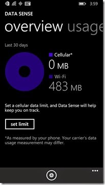
I had Data Sense on my T-Mobile powered devices for a while now, so this isn’t anything huge, but for my AT&T (unlocked) HTC 8x, adding this in was really nice. I never bought the whole we have the My ATT app for tracking data thing, and this just confirms what I thought. There isn’t any major issue with data tracking without changing servers, so why not include it even if only as a counter. Thanks for that one, it makes watching those soft data caps much nicer.

Data sense not only shows total data used on cellular, but also on Wi-Fi. It also will break it down by App usage as well. If you have a hard cap that you pay extra if you go over, Data sense will help you find those rogue apps very quickly so you can shut them down or uninstall them.
wp_ss_20140414_0010wp_ss_20140414_0012
Storage Sense helps you monitor your phone’s storage. For those with SD cards, you can also designate where Apps, Photos, Videos and Maps will go. This App literally brings the Lumia 520 series devices to the forefront of the Windows Phone crowd while making those without SD slots cringe a bit. Maybe there will be new life for my old Lumia 810 after all?
wp_ss_20140414_0011
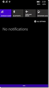
The new notification center actually has me a bit mixed. I was a fan of live tiles and thought they did a great job of letting me know if there was something new there. I do wish they had a 15 minute interval instead of 30, but it was all good. The new notification center is accessed with a simple slide downward from the top of the screen. You can select what accounts and content you want displayed on it and access 4 quick settings for one-touch use. It’s a great screen, but I just felt like I was using Android again when I first saw it… Bad memories of having to reset my phone twice a day immediately filled my mind.
wp_ss_20140414_0013wp_ss_20140414_0014
Quite a surprise change for me was the new Store layout. It now has a much more refined flow and looks a bit nicer than it did before. I definitely wouldn’t say this is a reason to update, but it is a nice little change.
The biggest question at this point for most users is whether or not it is worth risking the update to the 8.1 preview or not. First things first, if you don’t have a backup device that you can roll to if disaster strikes, then no, do not make the jump. Number two, if you don’t already have a developer account, don’t go get one to make this jump. Three, if you feel like the features above are worth it to you, then by all means, grab the developer preview. Remember, by worth it I mean by losing additional features on your device, not just a space requirement or something.
As you weigh out the choice of whether or not to pull the trigger on the preview, remember my thoughts on it. The third row of tiles is great on devices that are 4+” in size, but not much use below that. The new store really isn’t a feature worth caring about quite yet. The notification center is great, if you want that information available to you and the inclusion of all the Sense features is a great bonus as well. I never have serious issues with Storage or Battery, so those two are a bit superfluous to me. I do like having Data Sense on my device, but again, for T-Mobile style devices, that has been on board since the 810. Overall, I’m not risking the update on my Lumia 925, but I did try it on my 8x. So far, so good on the 8x, but I’m not sure my daily driver will get it any time soon. I have a feeling T-Mobile will push the update soon, so I will probably wait until then, maybe.

Update: So after reading a few more reviews of how the Developer Preview worked with Nokia Hardware, I have decided not to update my Lumia 925 quite yet. The post that mentioned the following issues, persuaded me not to pull the trigger yet. Here is a list of everything that was having some issues post update - Not working: Appstore, Nokia Music, Bluetooth problems, Crazy battery drain, Sudden lag (on my 1520!!) and the Camera acting weird and quitting for no reason sometimes. For now, I will keep in on the 8x and patiently wait for the actual update to roll out to my 925. Really like that third row of tiles, but not enough to pull the trigger.

Friday, April 11, 2014

Game Review: Dot Defense Delivers As A Simple Tower Defense Option

wp_ss_20140408_0009

There’s not much better than a challenging tower defense style game. Personally, I love the tower defense style and really enjoy not having to pay to play them. Previously, MythDefense LF has been the only TD game that really kept my interest long term. But when I was asked by Turboshroom to take a peek at Dot Defense, I couldn’t resist taking a stab at a new one.

5 of 5

Starting off with the weapons selection, you have three options available to you. The blue dots are a slow down weapon. The red launches exploding bullets. The green releases a poisonous cloud. All three weapon styles are key to progressing further in to the game, so make sure you learn how to use them together.

wp_ss_20140408_0010

The game starts out easy enough with a simple path to defend from the incoming dots. Start by dragging a few weapons near the path and watching them work. I found that placing a green gas cloud at the beginning of the path works well to take the edge off of the bad guys as they come out. Follow this with a few red towers and you will start blasting away. The blue towers need to be placed judiciously around the board to slow enemies down when your big guns come up.

As you max out your weapons, you can tap a weapon on the board to upgrade it. You will see the upgrade option in the center of the screen at the bottom when you tap on the weapon you want to upgrade. The price of the upgrade is on the far right of the center box. The other tip worth noting is that you can speed up the game by tapping the blue level indicator. This will launch the next wave of attackers without having to wait for that long cycling time to end.
wp_ss_20140408_0011

As you build out your weaponry, make sure to watch for weak points and leverage the double sided paths. If you can have a weapon that fires twice, it’s a better placement than one that fires once.

Dot Defense is definitely worth playing around with. With an install size of only 7.1 MB, it is a remarkably well coded game. I don’t think it will replace the costly MythDefense LF as my go to tower defense fix, but it’s small size and exciting play will keep in installed on my device for the foreseeable future. Turboshroom did an excellent job of coding Dot Defense as I found no issues with crashing or lagging. Everyone should take a minute to download this game and leave some feedback for the developer.

Download link: http://www.windowsphone.com/en-us/store/app/dot-defense/43d87df8-642b-4b29-b8d0-d4370cea55d0

Thursday, April 10, 2014

Game Review: Mind Your Step Is A Finger Flicking Beauty

wp_ss_20140409_0003

When Rune Selvag Golf contacted me about reviewing his new App, Mind Your Step, I was only thrilled to fulfill his request. After thrilling me, and killing me so many times with Flappy Bat, he has a special place in my heart. So that said, I popped in to the market and downloaded Mind Your Step with high expectations.

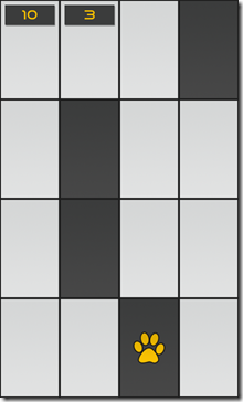
The game play was remarkably simple. There are three gaming options when you select the play button from the main menu. The first is how fast you can make 50 steps. The second is how many steps you can make in 30 seconds. The last is basically a survival mode where you need to go as far as you can without making any mistakes.

wp_ss_20140409_0005

The game controls don’t get any easier than this. Tap the square you want to move to. That’s it. Your paw print follows your fingers and you run through the dark gray squares as quickly as you can. Your score goes up as you continue through the steps and the board begins coming faster and faster, or at least I will say it did, because it makes me feel better to say that.

wp_ss_20140409_0004

Of course, about the time you have it “mastered” a misstep occurs and you are starting all over again. Fortunately for me, Mind Your Step wasn’t quite the catastrophic failure that Flappy Bat was. I actually was pretty good at this one. My issue was that after playing about an hour plus of this, I felt like I had seen it all. I guess I wish there was a splat, or a crunch or something when I failed miserably.

That said, I would still say that Mind Your Step is completely worth the 10MB install size as it will kill time on a bus, train or even a plane without any major issues. If you are looking for a rather simple game that will entertain you, Mind Your Step is a great bit of entertainment.

Wednesday, April 9, 2014

Grab A Lumia 925 And T-Mobile’s New $40 Plan

image

Have you been eyeing that new $199.95 Nokia Lumia 925 at HSN? Are you one of those users that is always on Wi-Fi, so you don’t need much data? If so, T-Mobile has a plan for you. Starting April 12th, T-Mobile will be offering unlimited talk, text and 500MB of LTE data for only $40 a month. With Taxes and fees, this plan will end up costing most users just under $50 a month.

If you aren’t a heavy data user, this plan is a great way to gain nationwide access to a very quick network in major metro areas. Outlying coverage is still suspect, but it is getting better. If you need the support of having a T-Mobile account, this is a great plan to roll into. It’s important to remember that along with your T-Mobile account comes local store help, device unlocking, carrier billing, short code SMS and additional services like T-Mobile TV.

Of course, if you don’t need the LTE speeds or support, the $39.99 plan from Spot Mobile is a great alternative to this deal. For that $39.99 flat rate, you get unlimited talk, text and data, with the first full GB at HSPA+ speeds.

Either way you decide to go, seeing a major carrier crack the $40 mark with a primary line plan with LTE data is impressive!

Source: T-Mobile

A Big Thank You To All Of You!

Graph of most popular countries among blog viewers

I recently found that numbers do a lot of talking as far as hardware demos go, and well, I thought I would brag a bit about you.

About 61% of the you visit this site from the USA. Germany, France and the UK make up the next 10% of the visitors. After that, folks from Russia, Japan, Latvia, India, Canada and The Netherlands come here for Windows Phone news as well. Sure, I don’t have the numbers of the big boy’s like Windows Phone Central, but I’m growing quickly with your help.

My biggest thank you is to the group of developers at Dvlup. Right now, Dvlup programmers are reaping some well deserved rewards for their amazing Apps that they give me the privilege to review for them. These great guys put together App after App with no expectation of becoming the next Flappy Bird, but they sure wouldn’t mind it if it happened. I am happy to support these fine folks and will continue to publish as many reviews as I can of their amazing Apps!

For now, thank you so much for taking the time to visit my blog. I hope you find something interesting here every day. I hope the hardware and App reviews give you the information you need to have more fun with your Windows Phone. If you see something that you would like to know more about, I would be happy to do a write up on it. Simply email me at smartphonedeals@gmail.com and I will see what I can do for you. Thanks again for reading and I look forward to sharing more with you in the future.

Tuesday, April 8, 2014

My Top 5 Photo Editing Apps

image
Recently, Nokia ran an article on their blog about the best photo editing Apps for the Nokia Lumia. The list the published is full of decent Apps, but only a few of the 5 make my list of the best photo editor for your Windows Phone. Their list iincluded: Nokia Creative Studio, Instalgram (Beta), Fresh Paint, Phototastic and PicsArt.
Below is the list of the top 5 photo editors that I have used for my Nokia Lumia 925. I would love to hear your thoughts on them and if there is something I am missing. Before you start reading, I really wanted to include Thumba, but they haven’t officially updated for Windows Phone 8 yet, so I am not sure if they still qualify as a current release or not. That said, here are my top 5 photo editing Apps.
Phototastic (FREE)
wp_ss_20140407_0041wp_ss_20140407_0040wp_ss_20140407_0039
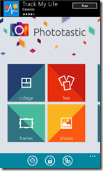
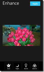
Yes, there is a paid version of Phototastic and yes it is well worth the $1.99 download cost. That said, you can easily play with your photos with the free version and turn out some really fun images. It almost seems like Phototastic was designed for the Instagram generation with its square formatting and easy sharing. Phototastic comes in at #5 on my list as it offers some easy ways to create collages and has basic editing capabilities.
Fotor (FREE)
wp_ss_20140407_0037wp_ss_20140407_0036wp_ss_20140407_0035
Fotor sneaks in to the #4 space on my countdown of editors. The free version of Fotor contains enough great editing tools to be good. The paid version is great. As a matter of fact, it would be higher up on the list if there were not as many new editors that offered more for free. The interface is clean and simple. The effects process well and minimize that ‘edited’ look. Final images usually turn out at a decent print quality.
Using Fotor couldn’t be more simple. You just open an image, and click through the bottom menus to select the features you want to apply or adjust. A single tap of the bar opens up the options and a second one selects the effect or edit. Overall, Fotor is an impressive free editor.
Photo Editor powered by Aviary (FREE)
wp_ss_20140407_0034wp_ss_20140407_0033wp_ss_20140407_0032
Photo Editor by Aviary is one of those online editors that used to drive me nuts. It did an OK job of auto-correcting images, but they just never turned out right. Aviary's Windows Phone app makes plenty of steps in the right direction and easily finds a home in my five favorite editors. The flexible design and the fun tidbits make it a bit more playful for photos, but everyone needs a bit of fun once in a while.
Nokia Creative Studio (FREE - Lumia Only)
wp_ss_20140407_0023wp_ss_20140407_0027wp_ss_20140407_0026wp_ss_20140407_0024
Nokia Creative Studio is one of those Apps that just works. It isn't filled with over the top functionality, but it does what it does very well. You can create a color pop image or a collage in play mode. You can edit the color balance, brightness, clarity and vibrance (saturation) as well. You can also fix red-eye and crop images in the Fix section. Finally, you can apply a focus object circle or a tilt-shift to an image. Overall, the basic 'photo filters' that come at the start of Nokia Creative Studio make this addition perfect on my Lumia 925.
Fhotoroom (FREE)
wp_ss_20140407_0031wp_ss_20140407_0030wp_ss_20140407_0029
Fhotoroom is one of the strongest editing programs that I have used next to Photoshop and GIMP on my computer. It has the functionality of a fully loaded photo editor packed into an interface that fits in the palm of you hand. Fhotoroom is easy enough to use for a beginner, yet powerful enough to make those 20MP and 41MP images shine.
From simple contrast adjustments to creating a bokeh on the edge of your images that make even the pro's blush. The power of Fhotoroom is unmatched in Windows Phone Apps today. While others may offer a bit easier method for posting a shot to Instagram, Fhotoroom creates works of art that can be saved to your OneDrive, shared in the Fhotoroom community or even shared on Facebook.
Fhotoroom is by far the best photo editing App available today. If you haven't tried it yet, give it a shot. You don't have to register for an account, but if you do, you can share you works with other Fhotoroom users - most of which are carrying a Windows Phone as well.

This is by no means a complete list, or may not even scratch the surface of what the best photo App for Windows Phone is. I can tell you this though, as a photographer, I can tell you the features I look for in a photo editor and these Apps fit the bill better than anything else I've tried so far. If you have recommendations, let me know in the comments below.