I love note taking Apps and even though I usually end up back where I started with OneNote, there are always a few that just do a better job. NoteBot Pro from erickfiveten is one such App. NoteBot Pro is simplistic to use, yet powerful enough to make even the most daunting notes (or to-do lists) seem easy. The interface is surprisingly basic, yet once you scratch the surface of this App, NoteBot Pro surprises you with an infinite amount of customizable options.
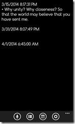
As I said above, the layout of the app is about as simple as you get. Your note starts with a date and then you type it in. Want to start a new note in the list with a new date? Just tap the calendar button at the bottom to insert the current date. Don’t feel like typing in your note? Press the microphone button and record it. Need bullet points? Got that covered too with the checkboxes in between the voice and calendar controls.
Reading mode, yes, I just made up my own name for this mode – but simply put, it’s the one without a keyboard on the screen, allows ample view of all the notes you have stored.
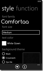
When you delve into the settings menus, things start to get real fun, In the style menu, NoteBot Pro allows you to select font styles, sizes, colors and even the background of the note screen. It lets you completely customize how your notes are going to look. It simply blows away anything else on the market right now as far as customizable looks go. Kudos on such a flexible design.
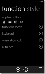
As we get to the next settings screen, you can set a few very handy features. First, you an set the controls to your liking with the appbar button control. You can set up everything from font adjustments to Tap+Send with these specialized buttons. Again, flexibility that should not be found in a App that is free, but we threw out the rules with the formatting options that were made available earlier.
The full screen mode allows you to take off the appbar menu and the system tray to keep the viewing area as large as possible. The keyboard section on NoteBot Pro will automatically show the keyboard when you open, but by turning this off, it goes straight to that reading mode that I mentioned above until you tap in the reading area to start typing. The orientation lock is pretty self explanatory, but it will lock the screen in portrait mode to keep you from having your view switch constantly if you are taking a note in a weird position. Finally, the auto bcc setting will take your NoteBot Pro notes and email them to an address of your choice.
It’s completely nuts that this many features were built in to NoteBot Pro, but there they are. When erickfiveten submitted this App to me, I figured it was going to be a 5 minute review of yet another note taking App for my phone and a quick delete after using it for a few hours. Needless to say, it’s a month later, and I don’t think I have used OneNote nearly as much this month – actually, I’m not sure if I used it at all during this month. So, consider this advice: if you take notes on your Windows Phone, go download NoteBot Pro right now. I mean it, stop reading and go get NoteBot Pro right now. It’s the first 6 star App that I have had the pleasure of reviewing from the Windows Phone Store.


No comments:
Post a Comment