Friday, May 30, 2014

Game Review: Traffic Racer

wp_ss_20140529_0001

Remember those top down view “racer” games like Spy Hunter and well, yeah, that was the only one I came up with also, If you were a fan of that style of play, Traffic Racer by Soner Kara is the next App you need to download to your Windows Phone. While the style of game play is similar though, I am sorry to tell you that I didn’t find the oil slick or the machine gun option anywhere in the game – but I am going to keep playing until I do.

wp_ss_20140529_0002

The game starts off easily enough with picking your vehicle type and color. When you play, you earn money to buy more vehicles, colors and options. Starting out, select the color of your truck and press play.

 wp_ss_20140529_0003

Choosing your gaming mode is next. For learning the controls and how they play with your device, I would recommend a free ride to start with. This is just a continuous game mode that resets your vehicle if you crash. There are two endless modes where you drive until you crash. The first features traffic only driving the same direction as you, where as the second has the traffic on the left coming towards you. Time trial is basically a race to see how far you can get in a limited time. All three of the competition options bring something different to the table.

wp_ss_20140529_0004

Driving is quite simple with Traffic Racer. Tilt your device left and you turn left. Tilt it right and you move to the right. The lower right hand side of the screen is your gas pedal and the lower left is the brake. If you keep your fingers low enough, they don’t interfere with game play at all with these controls.

 wp_ss_20140529_0006

Playing Traffic Racer is almost as easy as using the controls. Simply move left or right to avoid the traffic and keep going for as long as you can. When you hit another vehicle, your game ends. The graphics on Traffic Racer are great, and the play was smooth on my Nokia Lumia 925. I did find myself wanting to buy new cars faster than I was winning cash, but that’s probably my issue, not one with the game.

wp_ss_20140529_0007

Traffic Racer is a great old fashion driving classic. It also give the feel of the modern day runner style games, so if you are a fan of those, it’s worth a look as well. I think the only negative to the game is the 91.65 MB storage size that Storage Sense reported it using on my device. That said, 100MB for a great graphics game like Traffic Racer isn’t that bad in my head.

If you want to give Traffic Racer a look, it is available for free in the Windows Phone Store. I think it would be a great fit if you fall into the category of loving driving games or like those new style runner games. Either way, you should be thrilled with the play from Traffic Racer.

Store Link: Traffic Racer

Wednesday, May 28, 2014

Game Review: Tappy Dog Is Not Your Average Flappy Game

wp_ss_20140520_0002

When the developer of Tappy Dog reached out to me to take a peek at his work, I cringed at the thought of Flappy Bird clone number 1,987,243… Thankfully, Jason Thomas Carter didn’t produce yet another Flappy Bird, but what I like to consider as the most unique concept I’ve seen in a basic game in a long time. Tappy Dog is half reaction time and half state fair gaming fun.

 wp_ss_20140520_0003

Developed for the //publish/ NYC event, Tappy Dog is a simplistic, yet completely addictive multiplayer dog racing game. The controls are as basic as they come. Touching the green makes you go fast, yellow not so much and red just not at all. As the rectangles at the bottom of the screen change colors, you tap the green ones as fast as you can, and your dog begins its race to the finish.

wp_ss_20140520_0004

It took me a few tries to really get the hang of it, but this //publish/ NYC winner for Design and Innovation, just isn’t a tough one to figure out. Until you start racing against really good competitors online. That’s correct, there’s an online mode where you can race against other Tappy Dog users.

 wp_ss_20140520_0005

As you become a bit more agile fingered, you may find the challenge of this game a bit too easy. If that’s the case, start adding a bit of fun to it again by playing multi-fingered or even with your non-dominant hand. Tappy Dog isn’t just fun to play, it’s also a great game for hand eye coordination and reaction time practice. If I wasn’t having so much fun with it, my almost 5 year old would have had a blast with it.

With all the good things going for it, I completely recommend a download of Tappy Dog. I do have a bit of concern for those with lower device storage, as Storage Sense shows an install size of 84.19 MB. A further look shows that that App size installed is using 84.12 MB and the data is 69 KB. This seems a bit heavy for such a simple game, but it is probably due to the requirements of going online to play. We also know that Storage Sense is not always 100% accurate, but it is the only real way I have to compare installed App sizes consistently. Even with the larger install size, if you are running the 8.1 preview and have an SD slot or just have a 32GB device, grab yourself a download of Tappy Dog right now and give it a whirl. You can thank me later for the recommendation.

It is also available for Windows 8.1 as well for those with tablets and laptops that just can’t get enough Tappy Dog action!

Store Link: Tappy Dog for Windows Phone

Windows Phone: Leading The Way In Finding Your Way

nokia-here-maps-google-android-confronto

As most of the readers here know, I am in the middle of using an HTC One Android powered handset right now. As I use the device day to day, it makes me appreciate the solid package that Microsoft has with Windows Phone 8.1 and how much “extra” is needed to get Android to do the same basic features. While I have missed a few of the Apps that I use daily, like Nokia Mix Radio and the weekly view calendar, there are also a few gaping holes that Android has left to fill before it catches up with Windows Phone. Yes, I said that, before it catches up to Windows Phone.

ab470167-7e42-47aa-9824-d0c9bf4cf4a0

I know what people say about the accuracy of Here Maps and Here Drive+, but I don’t get it. About 99.9% of the time, Here gets me where I need to go, and does it without data. Sure, sometimes I need to hit a Wi-Fi connection or pop in to cellular data to look up a location for mapping, but the map itself is completely off line. They have also done an amazing job of keeping the map sizes to a minimum while keeping as much detail as possible. For example, my Washington Map in Here is about 120MB. The same map in Navigon is 650MB.

google-maps-offline-access

Recently, Google allowed map caching again, which allows you to “save” a map in the area where you are going for offline use. While this is a great function, what isn’t covered is that you only get 6 maps, and the area is very limited as to what you can save. While the smaller areas are great for when you reach your destination, most of the ‘navigation’ must be done online unless you want to pull over and stop at a few Starbucks along your route for the free Wi-Fi to update your saved maps.

Cover artCover art

Now there are few noteworthy Apps in Android to help bridge the gap between Here and Google. The first is NavFree USA. This program uses OSM mapping data that is completed by users. The more people that use it, the better the mapping system gets. NavFree is free to use, but offers paid premium features as well.

Navigon is probably the most complete offline navigation system for Android. The problem with Navigon is that it runs $39.95 for the US version. This isn’t cheap, but it really appears to be the strongest offline system available for Android. The irony of Navigon is the fact that it is powered by none other then, Here Maps.

It appears that Windows Phone, thanks to Nokia, has such a clear cut lead in navigation over the competition that if you are considering using your device as a GPS regularly, Here Maps should be a very strong reason to grab that new Nokia Lumia. Of course, Here is available for other devices, but why not just snag the new Lumia with its superior camera, brilliant display and amazing construction. Your cell bill will thank you for it with the ability save playlists offline with Nokia Mix Radio, save maps for offline use with Here Maps and of course, the data compression savings of Data Sense. Overall, it will save you a ton in possible overages while still giving you a first class navigation and entertainment experience.

Tuesday, May 27, 2014

Game Review: Catch A Hex

wp_ss_20140519_0001

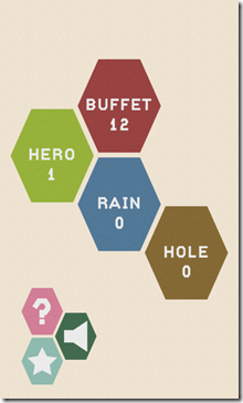
When a came like Catch A Hex comes along, it is really hard to review it. You need to look at the entire package and not just the individual games. Sometimes there are areas of a title that the programmers just nail, while there are other areas that just seem like an after thought. Fortunately, Turboshroom nails it with Catch A Hex and I don’t need to tell you about a ‘bad’ part of the game. With 4 gaming modes, Catch A Hex will keep even the most avid gamer glued to their Windows Phones for quite some time.

wp_ss_20140519_0002

The first mode to take a peek at is “Buffet” mode. This is a rather simple mode where the tiles light up and you have to tap them before they go out. It starts out easy enough, but when you start getting above 20, the speed picks up and the game gets more and more difficult.

wp_ss_20140519_0003

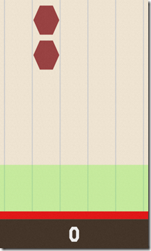
Hero mode is next up in Catch A Hex. Hero mode emulates the popular “guitar hero” style of play. The hexes fall from the top of the screen and you have to tap them in the safe zone at the bottom of the screen. For guitar hero fans that want a light weight version of the game, Catch A Hex is the perfect companion for you.

wp_ss_20140519_0005

Hole mode brought a hole new level of crazy to the game. The goal of this setup is to not allow your hexes to fall into the black hex at the center of the screen. Seems easy enough to do, but for some reason, this level gets hard fast. I can only imagine how much harder it gets after you’ve gotten really good at the game.

wp_ss_20140519_0006

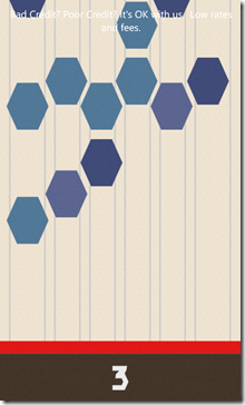
Finally, there is Rain mode. Rain mode is simply the Hero level on steroids. Pieces fall from the top and you have to tap the out before they touch the bottom. All in all, it wasn’t hitting the falling hexes that was a serious problem, but it was more often than not hitting the white space that killed me on this level. Rain mode was definitely my favorite of the 4 levels on Catch A Hex.

Catch A Hex clocks in at a paltry 9.2 MB in Storage Sense, which makes this an amazingly easy recommendation. Grab Catch A Hex now from the store and give it a play. Between the gaming options, the challenging levels and an overall smooth experience, Catch A Hex is a must download for every Windows Phone user.

Market Link: Catch A Hex

Saturday, May 24, 2014

Back To Android: The Camera Showdown

WIN_20140521_152853

The first thing that worried me about trying the HTC One after using my Windows Phone devices for so long was if the camera would be able to hold up well enough to produce even decent images. Going from the standard Nokia 8MP shooter on my Lumia 810 to the PureView camera on the Lumia 925 was a gigantic step forward. The last thing I wanted was to pull a step backwards and go from amazing images to a poor quality 4MP shot. So, let the testing begin.

These side by sides were shot on an overcast day at Woodland Park Zoo in Seattle. Both cameras were set up on Auto mode and were setup to select settings based on where the screen was touched. So, without further explanation, here is the first set of images.

01 02

The challenging aspect of this image set was the highly contrasting skyline and the darker area in the lower area of the penguin exhibit. Looking at the first image, the camera produced a much better exposure of the penguin area, but the sky became blown out. The lower image did a much better job of capturing the background, but left the foreground so dark that it is hard to make out the subject of the image. Overall, I prefer to lose a bit of the background and have the focal area turn out better. This one goes to Camera A.


03 04

Again, a challenging shooting situation. The darkness of the inside of the carousel against the brightness of the day outside through the glass enclosure. The first image delivers a better white and slightly more accurate coloring. The background coloring in the second image is more consistent with reality, but again, I am going to pick Camera A for the clarity of the subject over the slightly more detailed background.

 05 06

In this closer in shot, detailing became paramount. Of course, I was also inside a darkened carousel, which was a really great test of the lower light capabilities of both devices. As you can see, the first shot again pops the closer in details out and delivers a natural coloring. The second image is a bit more saturated, which can be a good thing or a bad thing. The gold tones in the second image are actually a bit closer to reality, but overall the first image is just a touch cleaner giving camera A another win.

 07 08

As I went into the bird house, I saw an amazing opportunity to snag a shot of a bird on a branch. Both cameras did a fantastic job of snagging this quick scene. The first image seemed to crop a bit more, but the colors came out almost electric. The second image was a bit more subtle and softer. My personal taste on this one would normally lean towards the sharper of the two images, which will again be Camera A.

09 10

On this outdoor shot, both cameras performed flawlessly. Side by side, the images look like they could have been taken by the same camera. You can see in the background again one image is a bit less detailed, but not so much so that you can say there’s a clear winner. I will call this one a draw between the two cameras.

11 12

Looking at the next image of an elk in a field, you can see the similar result that was produced with the penguin image above. The light areas at the top of the image are blown out in the first image, but the subject matter is much cleaner. The second image keeps much more detail in the clouds, but loses quite a bit in the subject area of the image. Again, I will take the detail that Camera A captures over the blown out background.

13 14

Taking the same image above and applying the full range of the digital zooms of both cameras produces a much different story. The first image just didn’t do a very good job of keeping the image smooth. The second zoomed image is much smoother, even if it is still grainy, at least it is the quality that you might want to share on Instagram or Facebook. This round goes to Camera B.

15 16

Moving back in to the forest area, there was a beautiful eagle in a tree behind a fenced off area. Image one was pretty accurate overall, and image two seemed to have a bit better exposure on the back side of things. Overall, this one comes out a tie with a slight, slight edge to Camera B, but not enough to win the round outright.

17 18

The close up of the eagle was even more interesting. I give the first camera props for being able to shoot through the fence so cleanly. The image turned out darker, but with decent detail for sharing. The second image is actually a cleaner image, maintaining a much smoother line than the first, but the exposure seemed to be thrown off by the dark bird and the lighter sky behind. Again, I won’t pick a direct winner on this one, but Camera A takes a slight edge on this one, even though I don’t think either one is a particularly great image.

Overall, I have to admit that I have chosen Camera A for the victory in this image contest. With an overall better performance, despite the terrible zoom quality, the device just did a better job in most cases. Now the biggest question is, which was Camera A and which was Camera B? Unfortunately for me, Camera A is the HTC One M7. It was a complete and total surprise to me that the One dominated my choice of images so heavily. Overall, both devices have a very capable camera, but the Nokia did not have the clear edge that I thought it would on this one. So, congratulations HTC on making such a great concept as UltraPixels and actually making them work. Now, that said, how about working on that zoom?

Wednesday, May 21, 2014

Back To Android: The Camera Showdown

WINDOWS-EU9QH7G - WIN_20140521_152853

The Nokia Lumia line is known for their amazing camera technology, where as the HTC One as put up as offering a newer style of camera known as the UltraPixel. While the image quality on both is pretty good – until you zoom – the actual controls of the software can make or break the experience for most users. I wanted to give everyone a quick rundown of my experience with Nokia Camera verses the latest Sense 6 camera interface from HTC.

wp_ss_20140513_0007

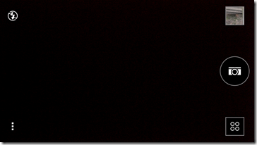
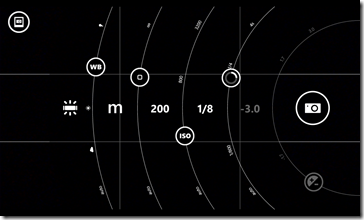
The basic interface on the Nokia Camera software is very simplistic. The top of the screen features the gallery button and the camera controls. These include flash, white balance, focus, ISO, shutter speed and exposure. You can also access the menu by pressing the three dots in the corner. To the right, you can select what mode you want to shoot in: video, camera and smart shoot. When you switch to auto-mode, many of the more advanced options are removed and you have only minimal controls to worry about. Overall a very nice layout with quick access to features.

Screenshot_2014-05-21-15-23-41

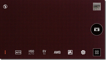
HTC took a much more simple approach to their new Sense 6 camera layout. The top left corner has the flash control. The top right, gallery viewing. Down the right side, you have a single button to take a photo. Below that, you have your mode button which gives you access to camera, video, selfie and zoe modes. I am not going to get into what cameras do and don’t do well here since this is more about form than function, but needless to say, the two click selfie mode is nice and zoe is just a hoot to play with.

wp_ss_20140513_0008

Image controls are something that I fell in love with on the Nokia system and I truly wish someone would steal this for Android. Of all the features that Nokia Cam has to offer, the controls are something that are unmatched by anything else on the market today. The “dials” that they use are simply perfect. Simply touch the slider you want to move and slide it up and down until you have your desired setting. It is truly camera perfection and makes my Lumia feel like my beloved Sony DSLR as far as setup goes.

Screenshot_2014-05-21-15-24-07

HTC’s camera controls leave a bit to be desired. They are a simple touch button with a touch menu that pops up above it. One tap and you see the menu and a second tap engages the preset that you select. Nothing fancy, but not quite as much control as the Nokia Slider method in my mind. It also seems a bit slower to have to access the individual settings instead of all of them at once.

wp_ss_20140513_0009

When I say access all the settings at once, I mean you can literally access every part of the image exposure process from one screen with Nokia Camera. By sliding the camera button to the left, all of the controls come up on scree at the same time. You can then set the sliders at whatever settings work best for the image you are taking and go with it. The nice part about this is you get a bit of a preview of the image while you are adjusting the sliders as well.

Screenshot_2014-05-21-15-24-40

The HTC settings will adjust as you go, but a simple change of ISO and EV rating can make a huge difference in the image. By not being able to do both together, it makes it hard to figure out what will happen when you make changes to both of them.

Screenshot_2014-05-21-15-48-55

Something that HTC did in their new camera layouts is include a nice variety of filters for using while shooting. Now you can shoot that daisy in Macro mode with a vignette filter pre-applied to it and have a perfect image right out of the phone. It’s a great little additional feature that requires the extra step of using something like Nokia’s Creative Studio on your Lumia device.

Now, the loaded question of, “Which camera is better?” will be following this shortly. The answer to that question is both. I have to honestly admit to taking some amazing shots with both cameras. My Lumiaography Blog highlights a few of the shots that I have taken with my 925 this year.

[WP_20140501_16_54_11_Pro%2520%25282%2529%255B2%255D.jpg]

WP_20140501_07_03_30_Pro (2)

Of course, not to be outdone, and I haven’t had a chance to take it anywhere really fun yet, here are a few shots from my HTC One adventures so far.

20140520_065757_Android (2)

20140515_065818_Android (2)

20140512_182318_Android (2)

As you can see the camera on the HTC is fully capable of handling itself against the big boys. The Lumia 925 camera is arguably the middle of the road in Windows Phone cameras today. It is a PureView model, but it is far from the quality that the 20MP Lumia 1520 and Lumia Icon carries or the 41MP Lumia 1020. Of course, unless you a printing a billboard, the only reason you would want more MP would be if you were cropping a wide shot down to a smaller shot.

That said, the HTC does not have the ability to zoom AT ALL! Yes, you can zoom in, but the resulting image quality is so pixelated, you probably would just delete each and every shot you take with it.

20140521_070052_Android

Here is a 100% shot of a deer taken under a freeway ramp. The image was dark, so the One’s camera did a great job of bringing out the details in the lighting aspect, but when you zoom in on the pixels at 100%, it is a different story.

Overall, if you are shooting family parties, a night out with friends, or your dinner, the HTC One camera is flat out great. If you are trying to shoot some landscapes, or other distance shots where details make or break it, I’d stick with the PureView Lumia devices. They just offer more control and a better camera experience.