As some of you know, I have been lucky enough to have the privilege to test drive a new HTC One device to get a feel for how far the Android software, and the HTC hardware has come since my old HTC Evo 4G running Gingerbread. First off, I need to confess the fact that the hardware is amazing and if this was running Windows Phone, it would be enough for me to give up my precious Nokia Lumia 925.
Overall the software does a great job, although I can see many areas where Windows Phone has moved ahead of the competition. I’m going to take a few minutes to highlight the lowlights of my first few days with the HTC One and see where the Lumia still shines brighter.
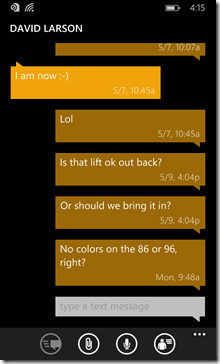
Text Messaging: The Lumia has a super clean SMS/MMS interface. Good contrasting colors and easy to follow “bright and dark” conversation bars just make life simple. The HTC One has a dull gray background with a left and right separation only. Overall, both do the job just fine, but the Windows Phone interface is just a bit more customizable. That said, you can easily score an App like Handcent or GoSMS and do all the customizing you want, for the small price of some system resources.
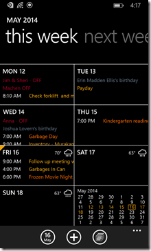
Calendar: Ok, this is one I actually had to download an App to fix. I fell for the week view calendar in Windows Phone 8.1. It gives me just enough information at a size that is just large enough to read. The HTC weekly view just blocks out items and doesn’t show details. I wanted to see the details, but the only option for doing so with the One is to have it in daily or agenda view. I had to fix this by downloading aCalendar+, which makes the calendar identical to the one on Windows Phone 8.1.
Notification Center: Now that Windows Phone 8.1 has one, how good is it? Pretty good if you compare it to the competition. The HTC screen contains way more data, but again, the sharp contrasts of Windows Phone makes a strong case for itself. Overall, this is one area that I actually prefer the HTC version of the screen over the Windows Phone. It’s a bit cleaner, simpler and gives me touch access to almost every setting on the device with one click.
It’s been a good start to being reintroduced to Android and I can’t wait to take some real runs with the HTC One to see how it does. Next up, the media test…


No comments:
Post a Comment